Post | 01 Apr 2026
New Site Design & Style Live
Starting from a very white, fairly plain structure, I have gradually added sections, pages and functionality to this website over its first few weeks. The intention was always to get the bones of it working first and then shape the design around that, otherwise I would have been stuck in a loop of styling something, breaking it, fixing functionality, then styling it again. The visual direction you're seeing now, with the galaxy background and darker outer shell, is much closer to what I had in mind all along and something I had never really managed to pull off properly in older WordPress attempts.
Description
The looping galaxy video background now gives the whole site its overall atmosphere. It is the first thing that defines the feel of it and it changes the website from being simply a container for text into something with a bit of presence. It is dynamic without being too busy, and it is heavily inspired by old Apple Mac OS X 10.5 / Snow Leopard, particularly the old Time Machine animation where it felt as if you were floating through space. Back around 2009, when I was still new to the Mac, that sort of visual polish made a massive impression on me. A lot of interfaces now feel more efficient but also flatter and more clinical, so I liked the idea of bringing a little bit of that atmosphere back.
I licensed this background from Envato back in 2021 for an older website idea and it has been sitting in my archive ever since. Now it has finally found a home as the central visual feature of this site. I did question whether using a video background at all was a good idea. Would it be distracting? Too immersive? A bit tacky? But those doubts started to fade when I looked at the websites of some very big names in tech and found the same sort of white background, plain header and safe layout over and over again, which is more or less where my own site had started too. It was tidy enough, but it did not have much identity. This was a small chance to do something a bit more memorable and to make the site feel more like a place rather than a document.
One thing I had not really appreciated until now was that the design is not just the background. What makes it work is the contrast between that moving outer layer and the actual content areas sitting on top of it. Most of the content now lives inside rounded cards with light borders and slightly softened backgrounds, so the text remains clean and readable while the site still keeps the drama of the video behind it. In a way, the layout now feels a bit like glass panels placed in front of the background rather than content simply floating over it. That has helped the site feel cleaner, more intentional and easier to scan.
The header and footer are deliberately kept dark at all times. I did think about making the whole site far more aggressively responsive to light and dark mode, or even just going dark-mode only, but keeping those sections black helps frame the page consistently and suits the overall look much better. It also means that people who use dark mode constantly are not suddenly hit with big bright slabs at the top and bottom of the screen. The site still supports light and dark styling within the content itself, but the surrounding shell now has a much more fixed identity.
![]()
I have also slowly started introducing more icons, not only because they look nice, but because they help break up repeated blocks of text and make sections quicker to understand at a glance. A small amount of logic now determines which icon appears on update posts and other areas, and although that is a small technical detail, it contributes quite a lot to the visual rhythm of the page.
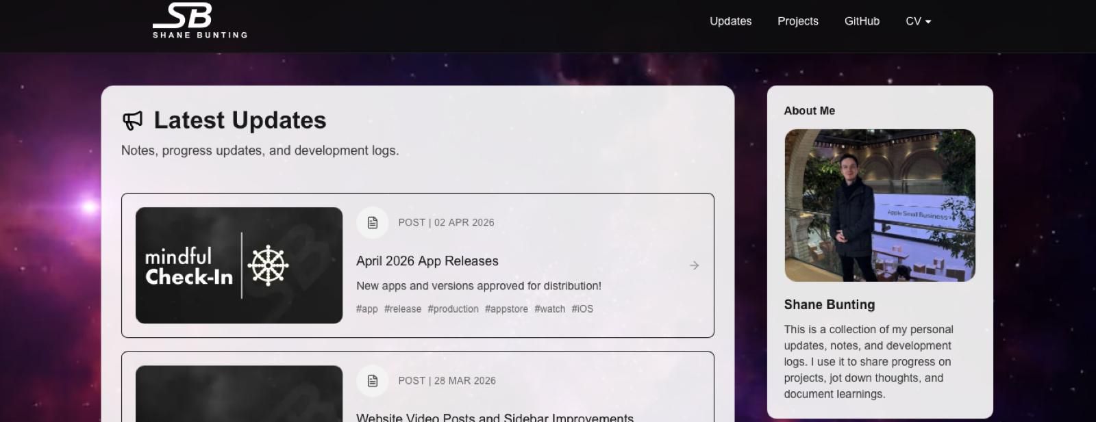
The homepage in particular feels much stronger now. Rather than one long central list of text, it reads more like an editorial layout, with the main updates feed taking most of the space while the right-hand sidebar introduces other parts of the site such as my profile, selected repositories and tags. That sidebar does a lot of work in making the page feel more like an actual personal website and less like a blog index. The profile photo especially adds a bit of humanity that was missing before.
The projects page benefits a lot from this newer style too. That page gives me room to be a bit more colourful and a bit less restrained than the updates feed, particularly around the Mindful Check-In feature section. The brighter gradient panels, app imagery and more card-like presentation help it feel more like a showcase. The rest of the site is mostly monochrome and intentionally restrained, so those more colourful project sections stand out nicely when they appear.
Another thing I think has helped is the consistency of the smaller details. The sticky header, the rounded corners, the thin borders, the hover states, the custom logo in the top left and the overall spacing now all feel like they belong to the same design system rather than being a collection of separate experiments. It still is an evolving site, of course, but it has a more recognisable visual identity now than it did even a week or two ago.
Overall Progress Update
I am still tweaking parts of the CV pages and steadily improving the content and layout of Updates, but the site now feels like it has crossed an important line. Before, it worked. Now it feels like it actually looks like something. That is a satisfying difference.
Making endless little changes to this has been strangely addictive. I have learned a lot from repeatedly revisiting the same pages, adjusting spacing, changing class names, rethinking layout decisions and finding better ways to structure content. Next.js and Tailwind in particular have both been very interesting to work with. A lot of the process is repetitive, but over time it becomes easier to understand where to look, what to change and how the different parts of the site relate to each other. My comfort level in VSCode has grown massively through this project as well, especially compared with my more familiar use of Xcode and Visual Studio. Even using GitHub from Terminal is becoming more natural now.
When the site gets closer to being truly settled, most of its activity will probably come in the form of updates like this, project additions and reflections on what I am learning as I go. For now though, I am enjoying the stage where the website is still being discovered, refined and given a bit more personality.